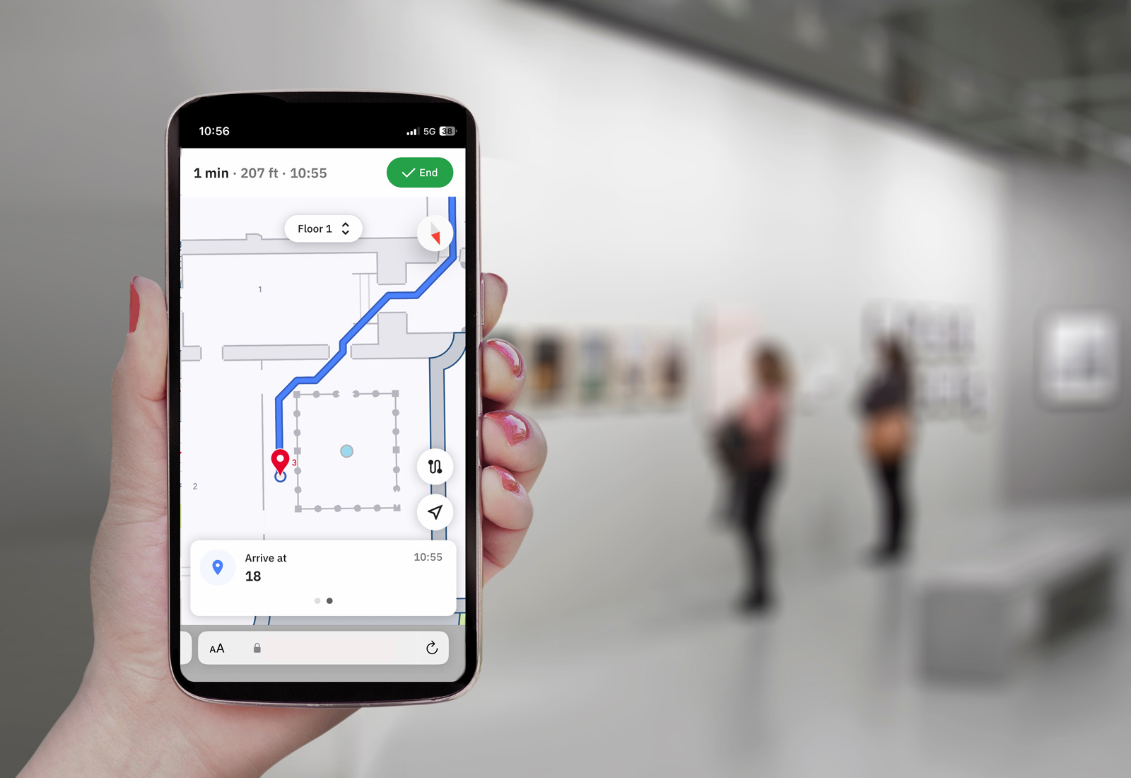
Research shows that 80% of council websites are now responsive, but that this rarely extends to the library sites.
For those that use Axiell’s Arena Discovery interface, there is the option to add a responsive design feature, which means that, whatever size screen the site is viewed on, it will automatically resize so that the patron doesn’t have to zoom in and out or excessively scroll. This makes for a much better online experience, and makes the library’s discovery portal accessible across a range of mobile devices, from phones to tablets.
You can read our previous blog on the subject to find out why being mobile-friendly is so crucial.


